Bringing three separate products into one experience
I led the UX work for a key user group, improving flows and interactions across several interfaces and bringing in the new visual redesign to unify the experience.
Goals
The redesign aimed to unify our product landscape and consolidate multiple products and their interfaces, both in terms of information architecture and interaction patterns.
Additionally, we updated the entire company’s UI to match the new brand identity and evolved the design based on what we learned along the way, always keeping the highest UX standards in mind.

While hotline staff lives inside the interface and manage large amounts of information simultaneously, sales representatives only use certain parts of it. Their workflows differ dramatically.

We realized that we needed a layout that was extremely flexible in both appearance and use, without feeling arbitrary or chaotic.

So we started experimenting with layouts and viewports and tested new versions every week with different target groups. Each week the design became a little clearer. A little better.

Once we had a solid understanding of the layout, we moved on to refining the UI design.
We invited stakeholders from across the company and ran additional sprints. The goal was to turn vague design requirements into concrete, actionable improvements, to enhance the product with the new design and to better understand how to apply it consistently.


During this process, we discovered that the new design opened up entirely new possibilities and at the same time created new challenges.


Examples of early UI design:
Layouts, card design, typography, icons and color
Results
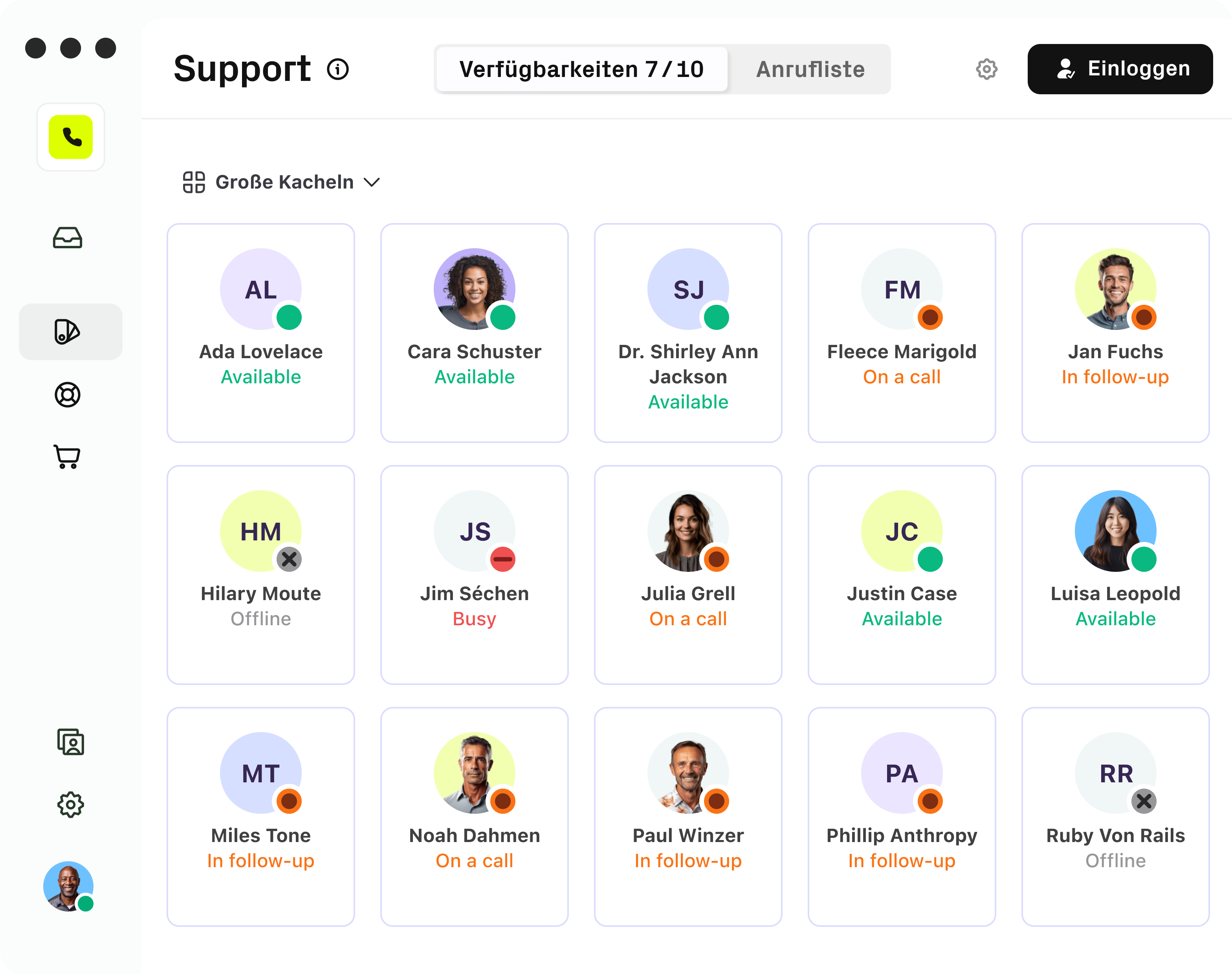
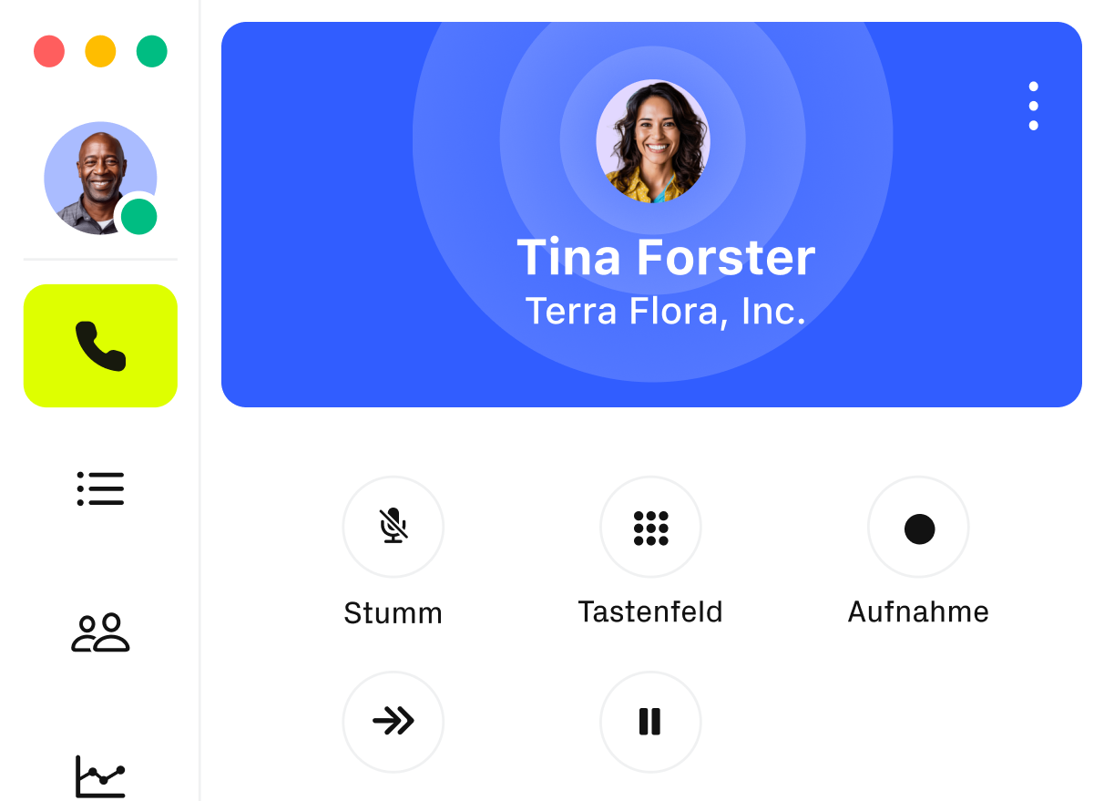
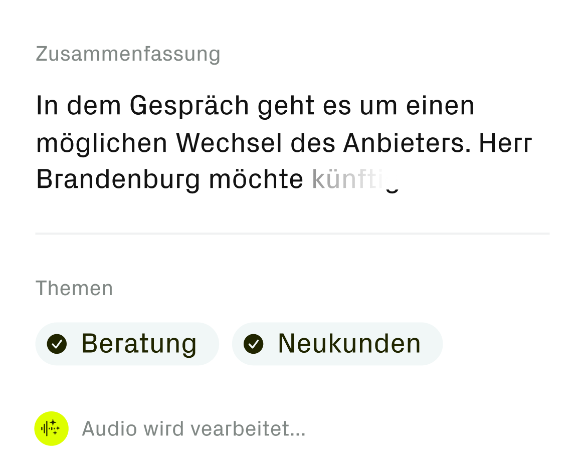
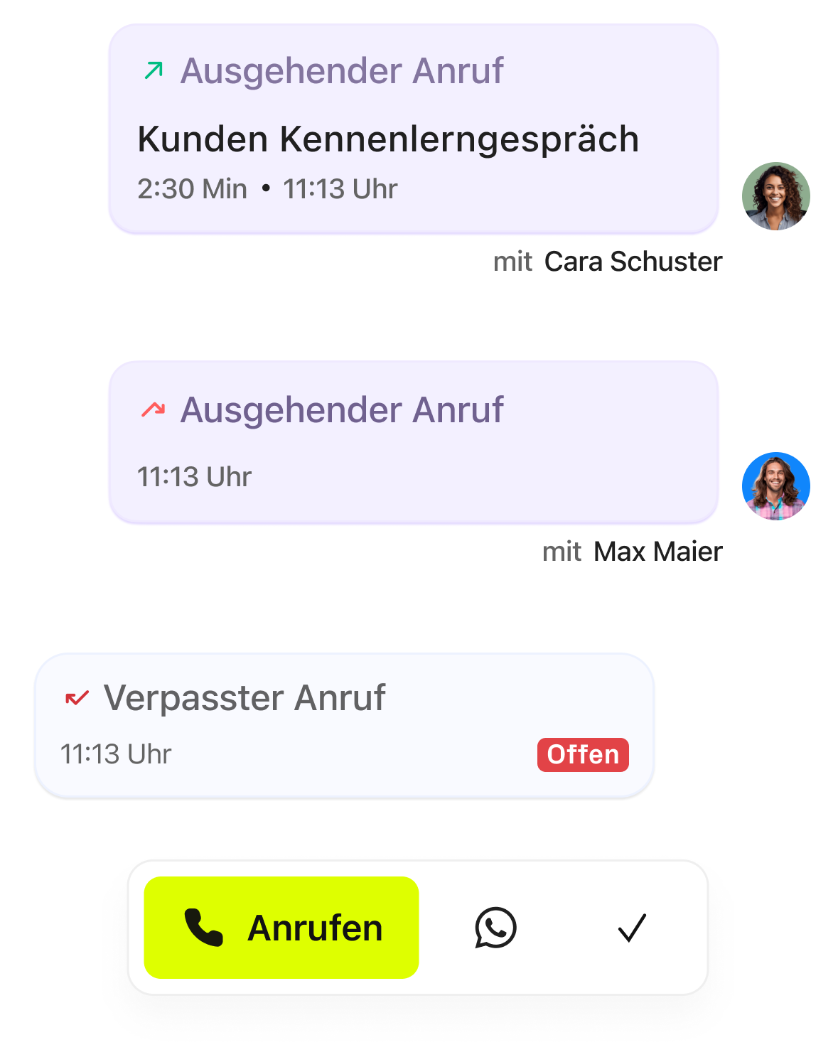
Hotline
Hotline staff need a large interface to manage many calls and see key information at once.
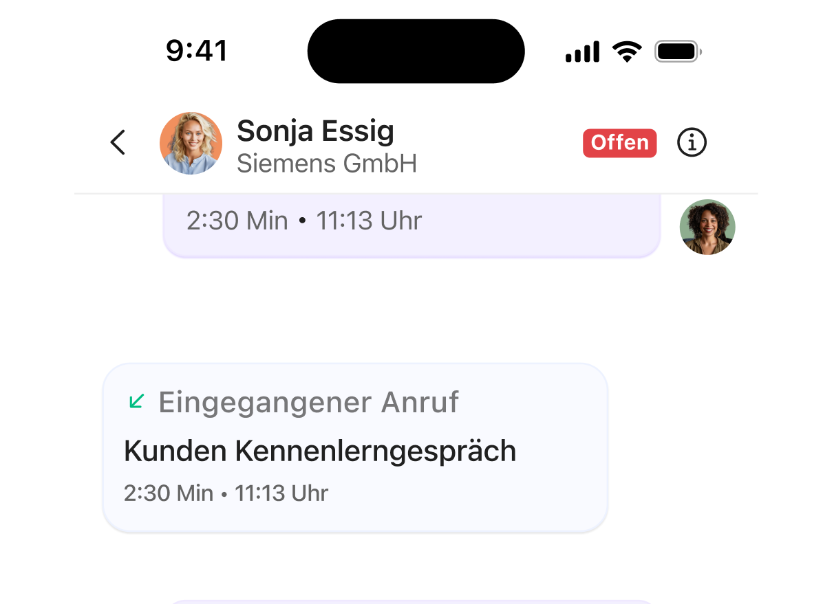
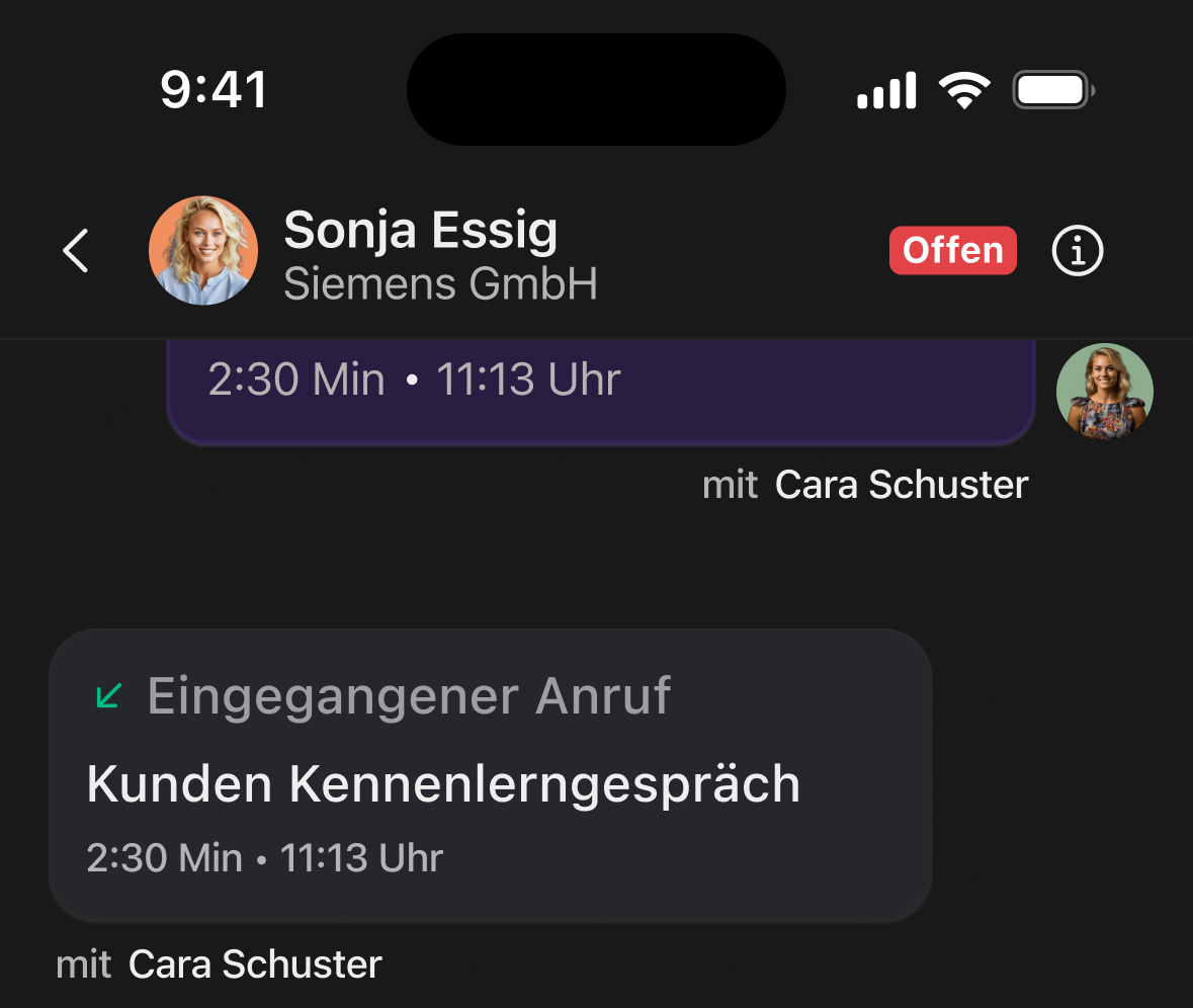
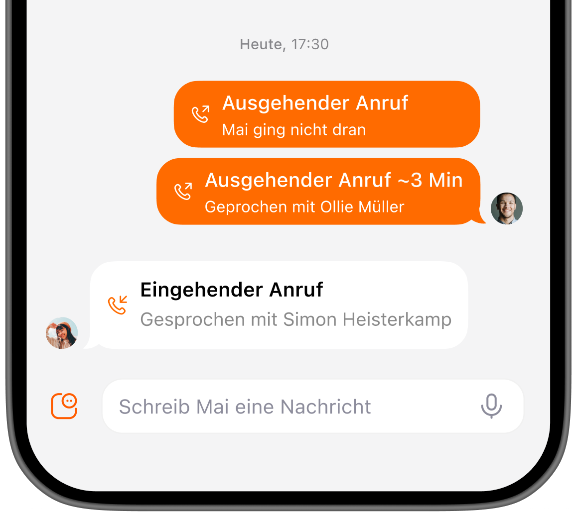
Casual User
Casual users rely on their smartphone for quick, simple calls without extra complexity.
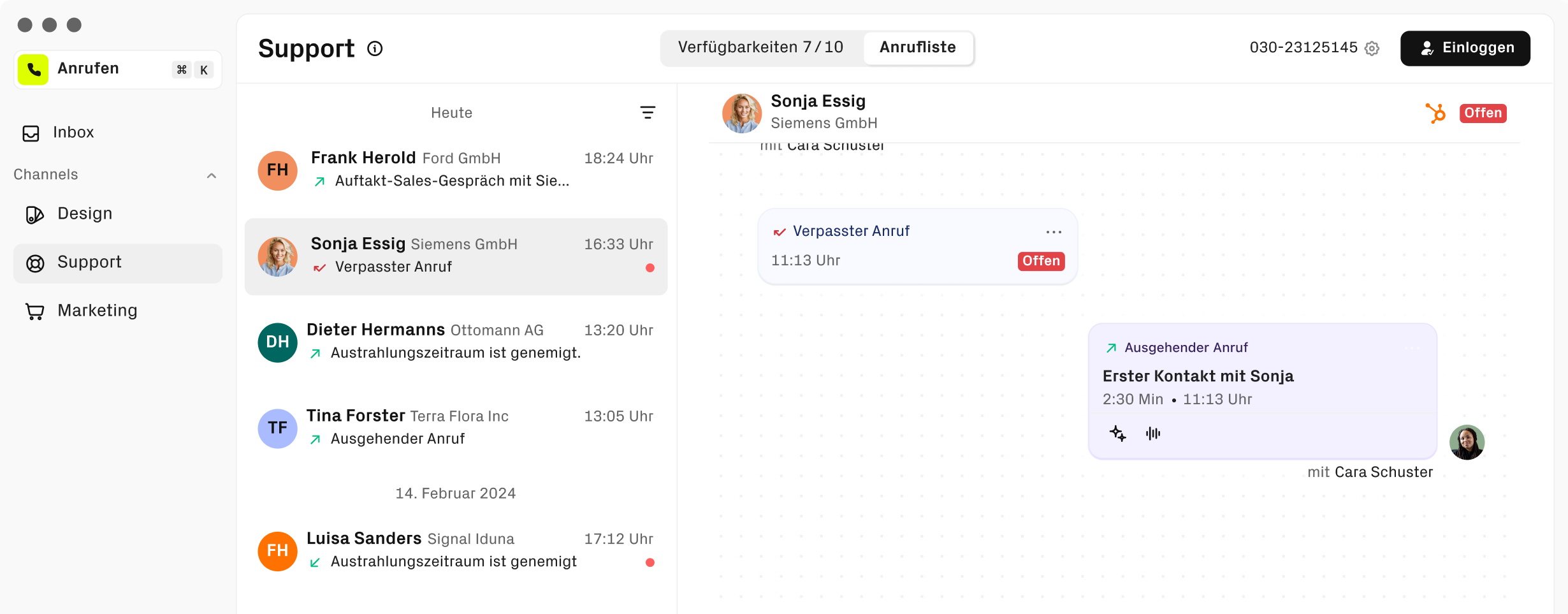
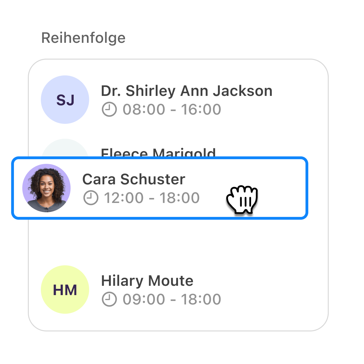
Sales
Sales staff prefer a condensed version showing only the features they use, speeding up their workflow.
By separating views based on use cases, the interface became less crowded. This reduction in visual noise makes it easier for users to stay focused.
Purposeful Animations That Enhance User Experience
We found that subtle animations make it easier for users to see what’s happening. Adding them guides attention and makes interactions feel natural.

Unified Design Across All Interfaces
Users were confused by different layouts across tools. Using a consistent visual style helps hotline staff, sales teams, and office users work without guessing.
Workflows That Connect
Switching between systems slowed users down. Streamlining workflows and surfacing the right customer data helps them act faster and more confidently.
Easy and Clear to Use
Complex paths and too many clicks frustrated users. Simplifying flows and interactions keeps focus on what matters most.
Dark and Light Mode
A unified brand language across the entire product suite, creating a consistent experience for hotline staff, sales teams, and office users alike.
This project was a real team effort💪, and I appreciate everyone I got to work with throughout the project.


Want to keep reading?
The satellite project shows how we redesigned a mobile app to be more engaging, intuitive and ready for
the future.