

satellite is a mobile app for iOS and Android that lets users make and receive calls without a SIM card. Every user gets their own mobile number that works anywhere.
Over the years, the app had gained loyal users but also accumulated design debt:
Messy UX: features felt disconnected
Limited scalability: restricted expansion
Outdated look did not match product maturity

Approach

Results:
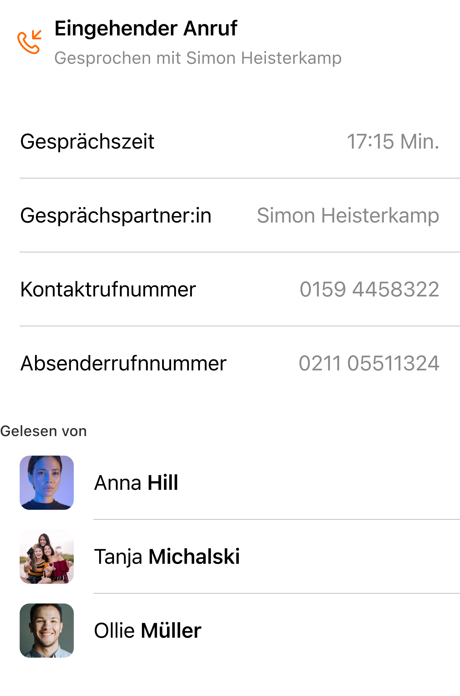
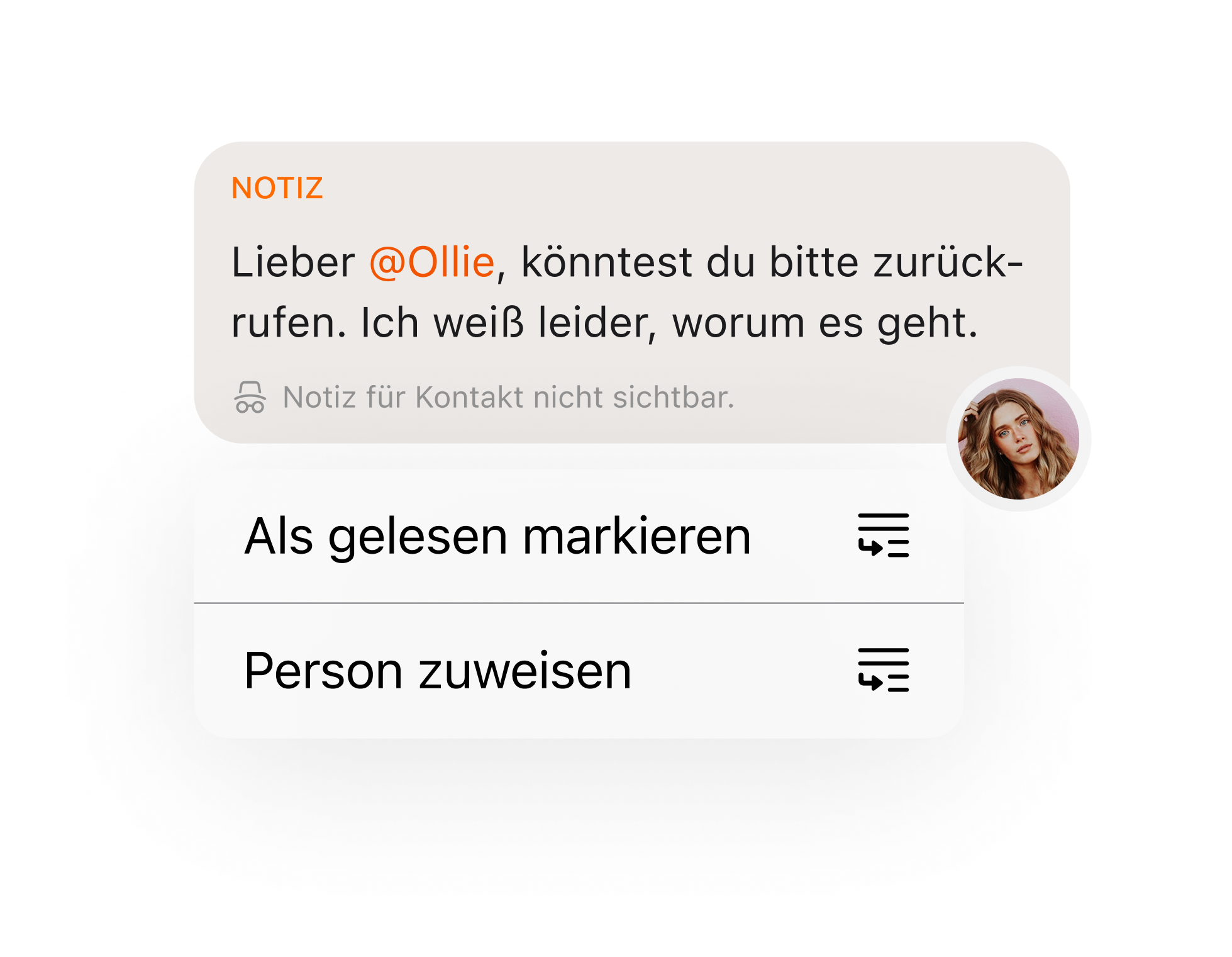
Creating Aha Moments
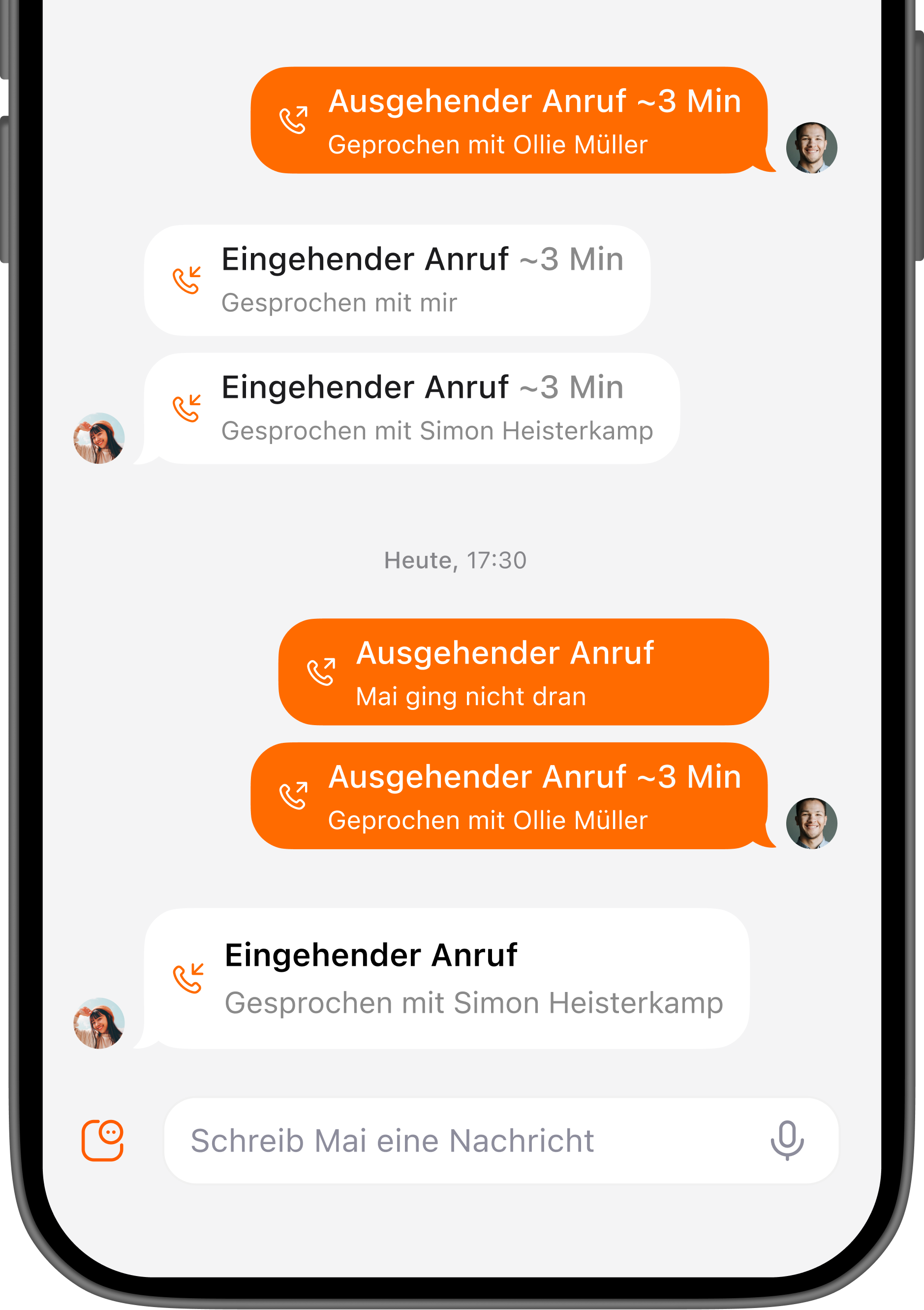
Clear Paths Through the Product
Users quickly understood what the app could do and how to navigate it. The redesigned structure and onboarding moments turned confusion into confidence — a clear “aha!” when they realized how simple things actually were.

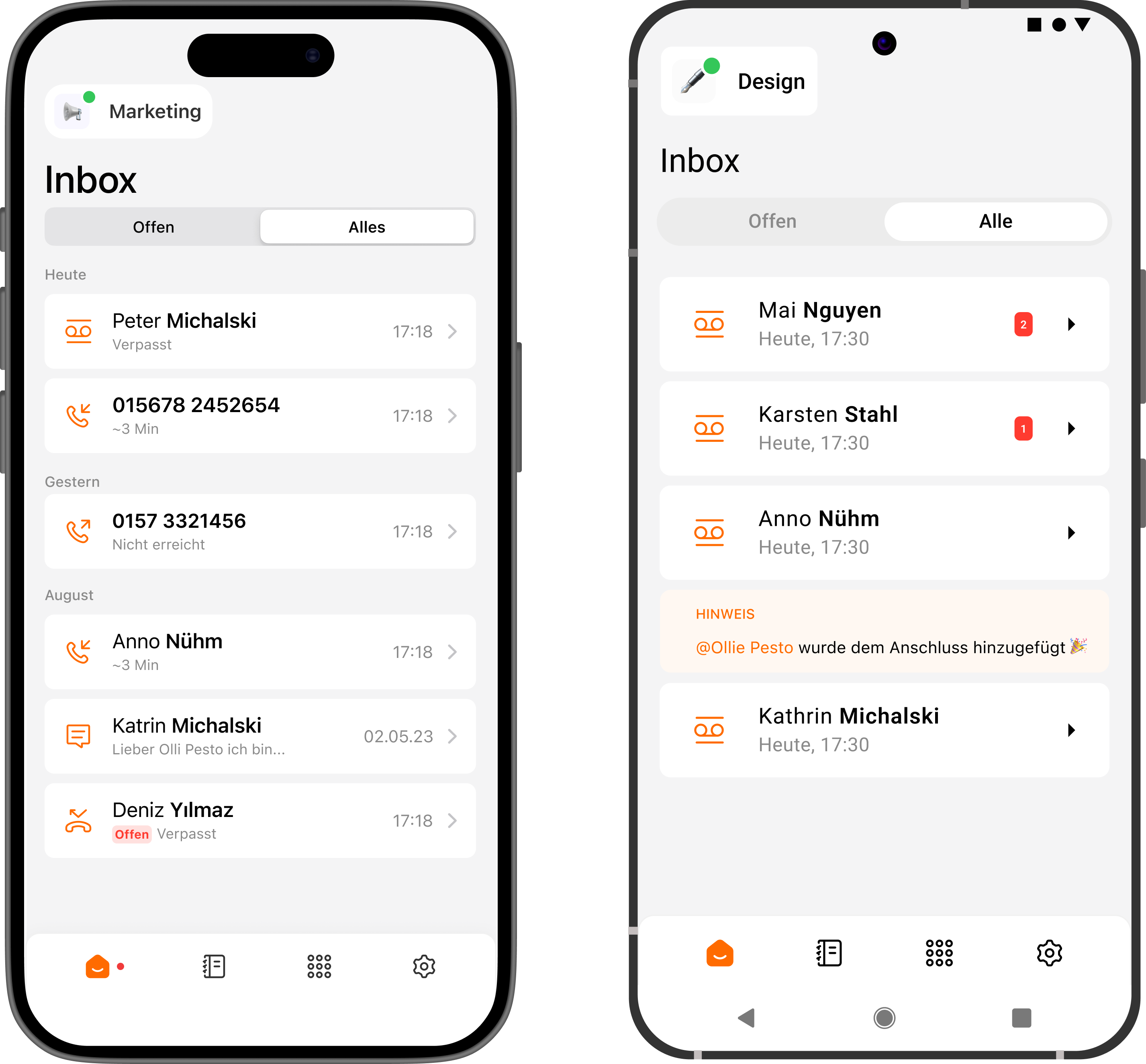
Familiar Yet Distinct
By referencing familiar interaction patterns from other communication apps, we reduced the learning curve. Users instantly recognized how to perform key actions, even when encountering new features.
Results:
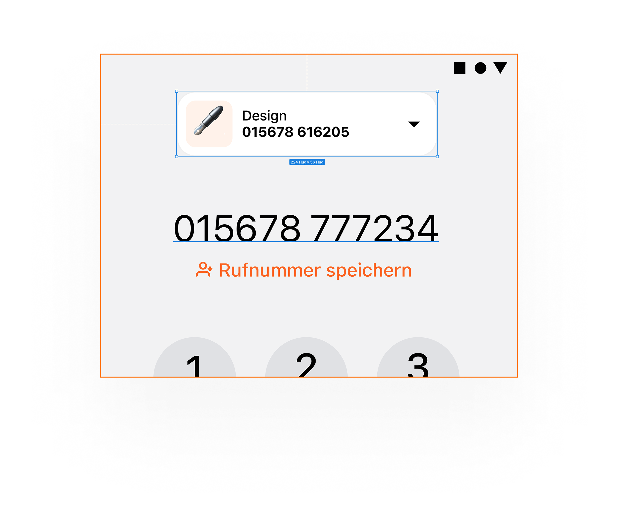
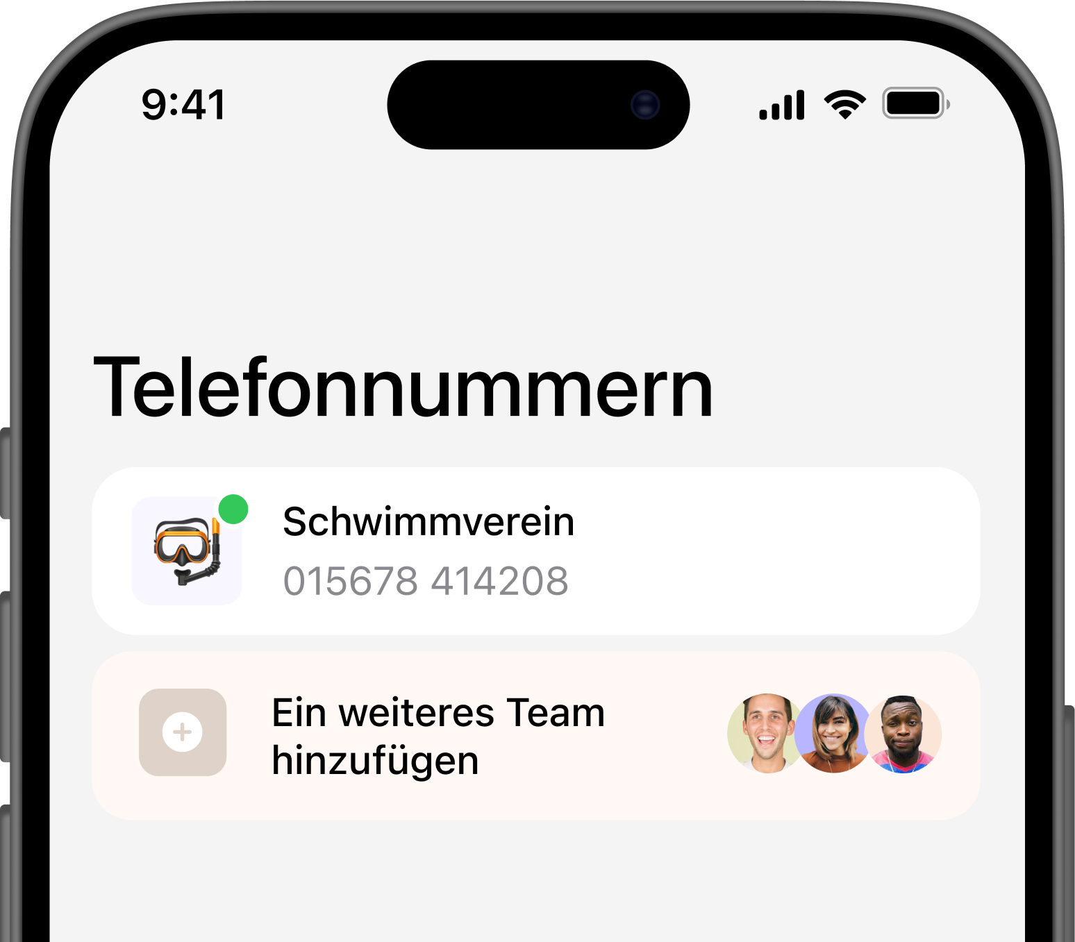
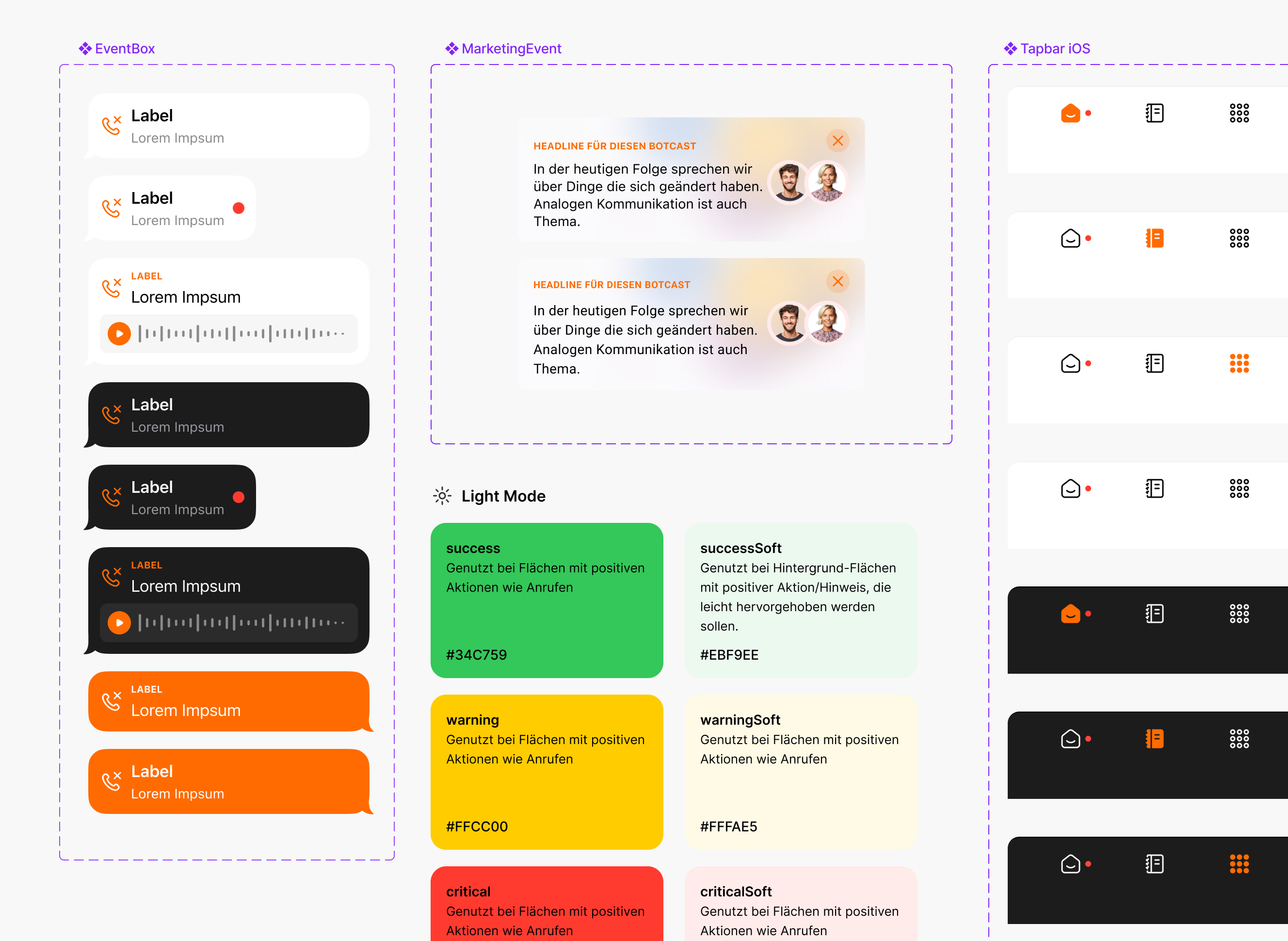
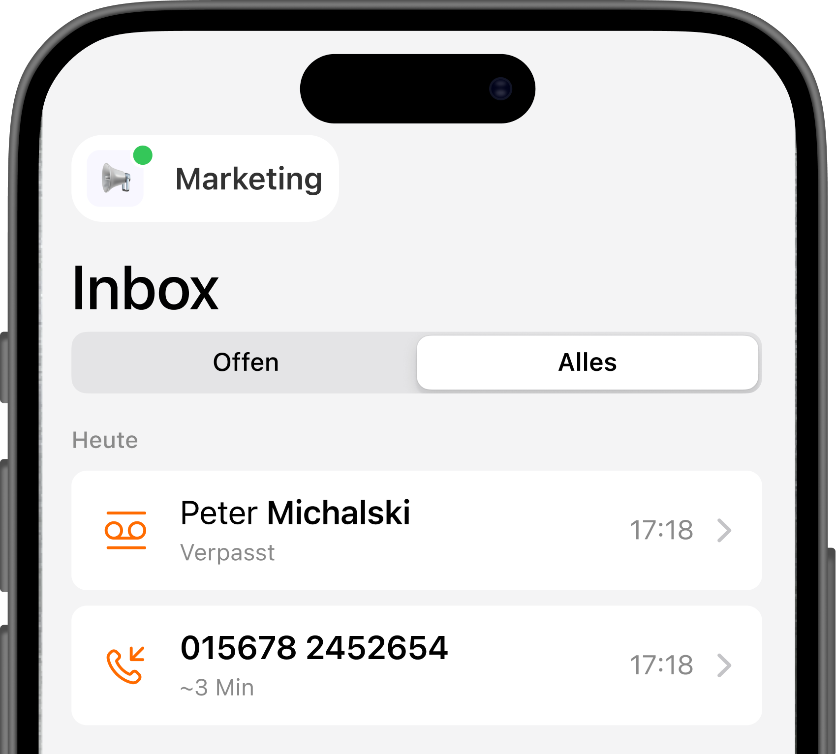
Design That Feels Native
Typography
We adopted Roboto and SF Pro, leveraging the native typefaces of Android and iOS. This decision made the app feel like a natural extension of each system, enhancing trust and readability.

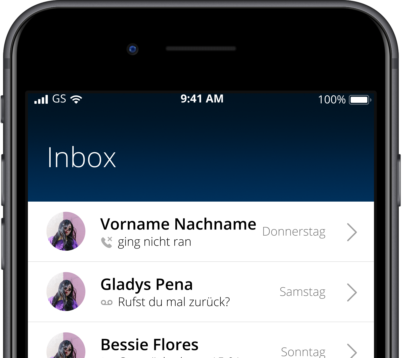
Old design
New design
Results:
Preparing for the Future
Space for What’s Coming
Dedicated areas in the layout anticipate upcoming features, ensuring the system can scale gracefully.
The redesign also introduced small communication touchpoints — subtle messages and previews that
connect users with the satellite team and what’s next.


Want to keep reading?
This project explains how several separate products were turned into one clear and consistent
experience with better workflows and structure.
